UI Design Notes
As a non-designer who has to design, I am putting together this collection of UI snippets of pretty design which are, importantly, easy to emulate.
The idea for this collection is to build up a repertoire of design techniques that can be easily applied. This is useful for those moments where you simply do not have the inspiration, idea or energy to think of something new.
"Good artists copy. Great artists steal."
Case Study 20

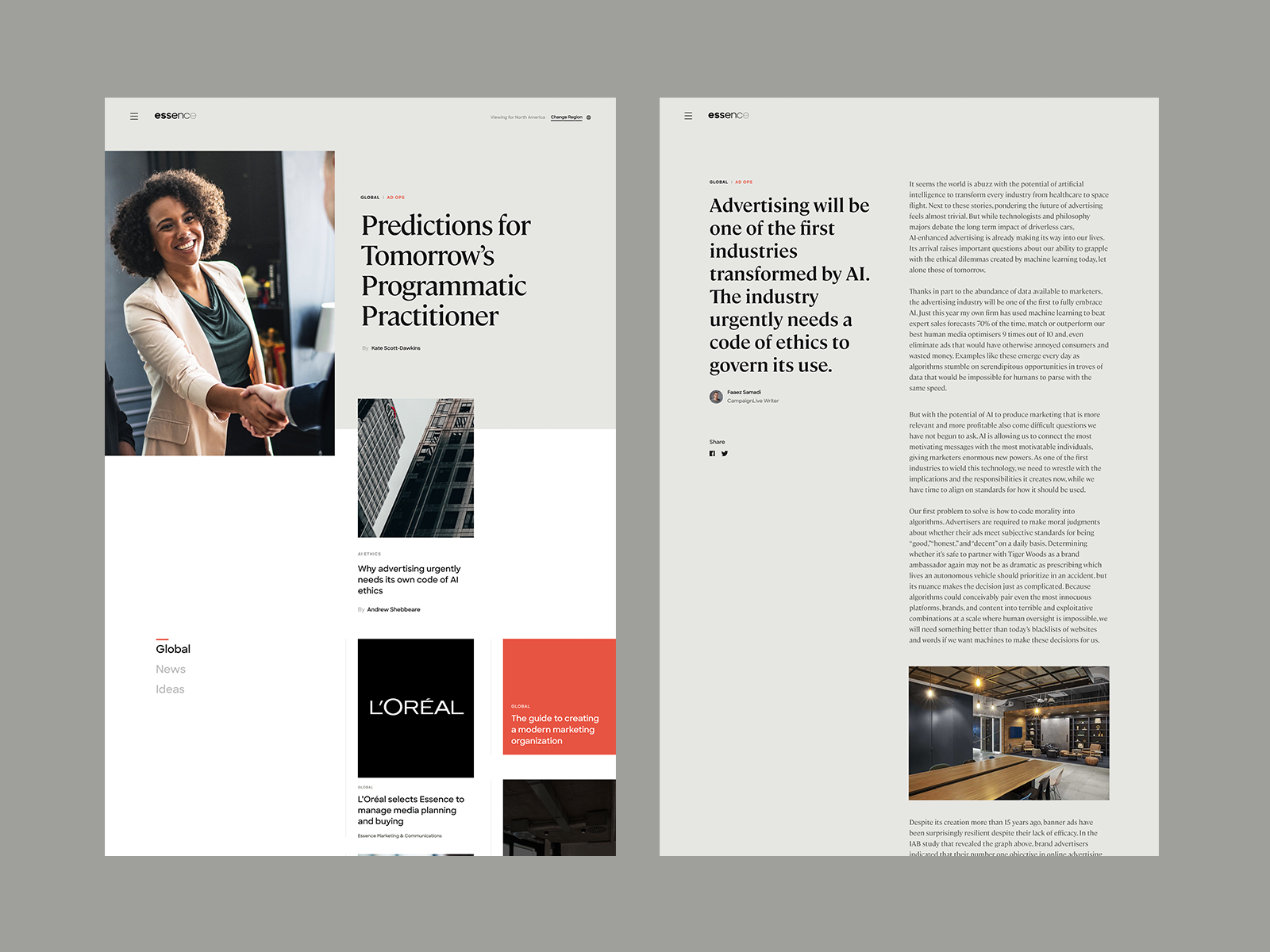
Sample design for a medical website with minimal textual information.
Tags: magazine
Source: Dribbble
Case Study 16
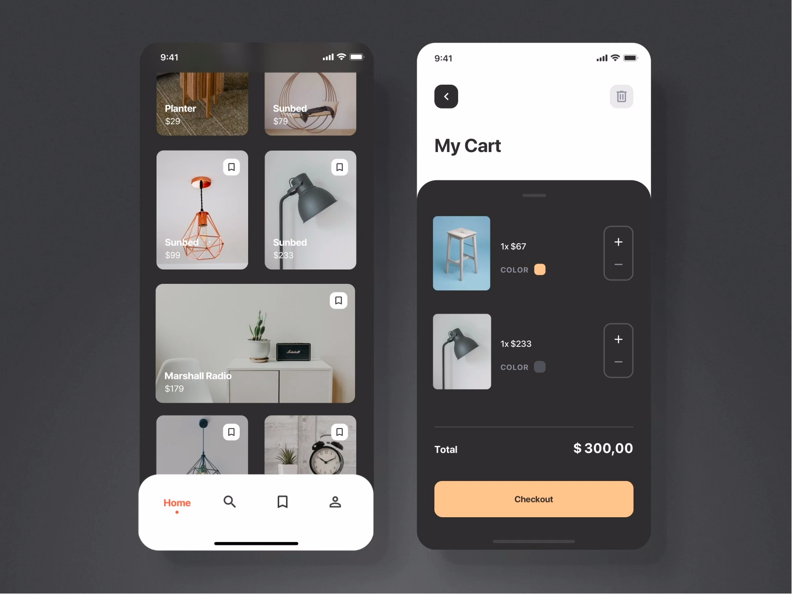
Colour scheme for "atas" (high-class) feel.
Tags: atas, luxury, high-class
Source: Dribbble
Case Study 12
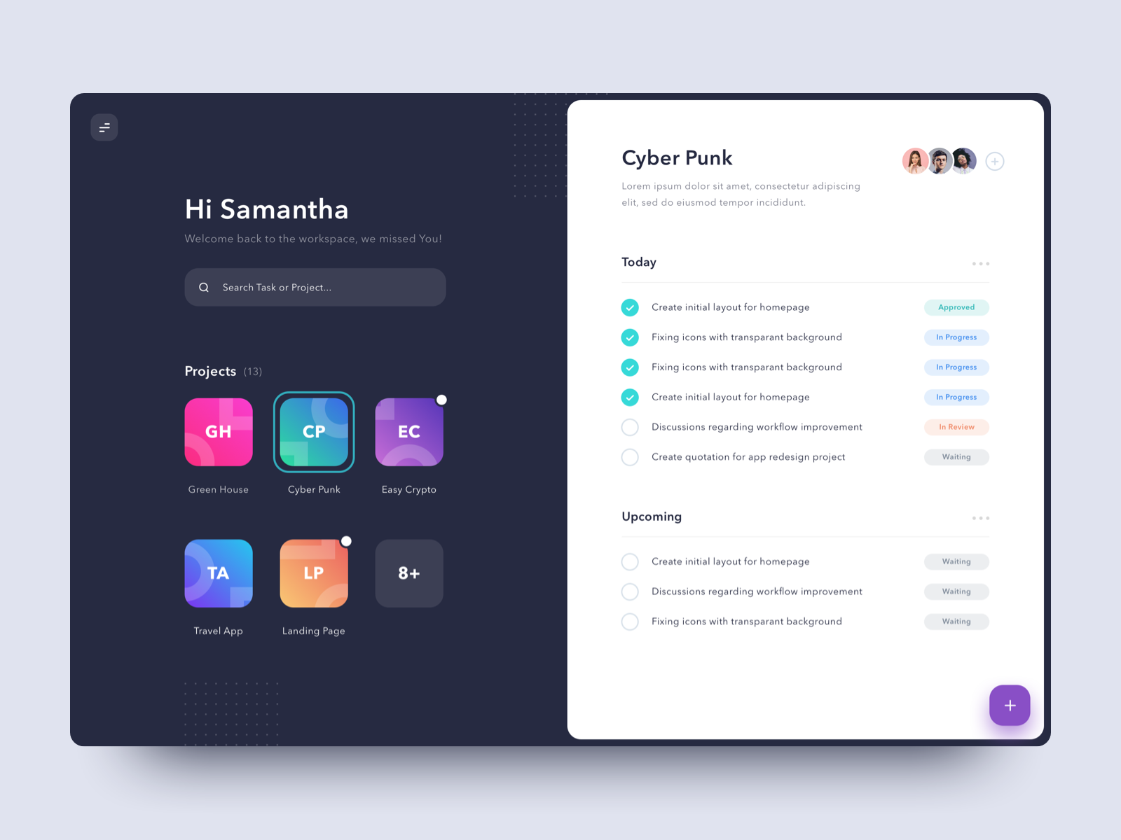
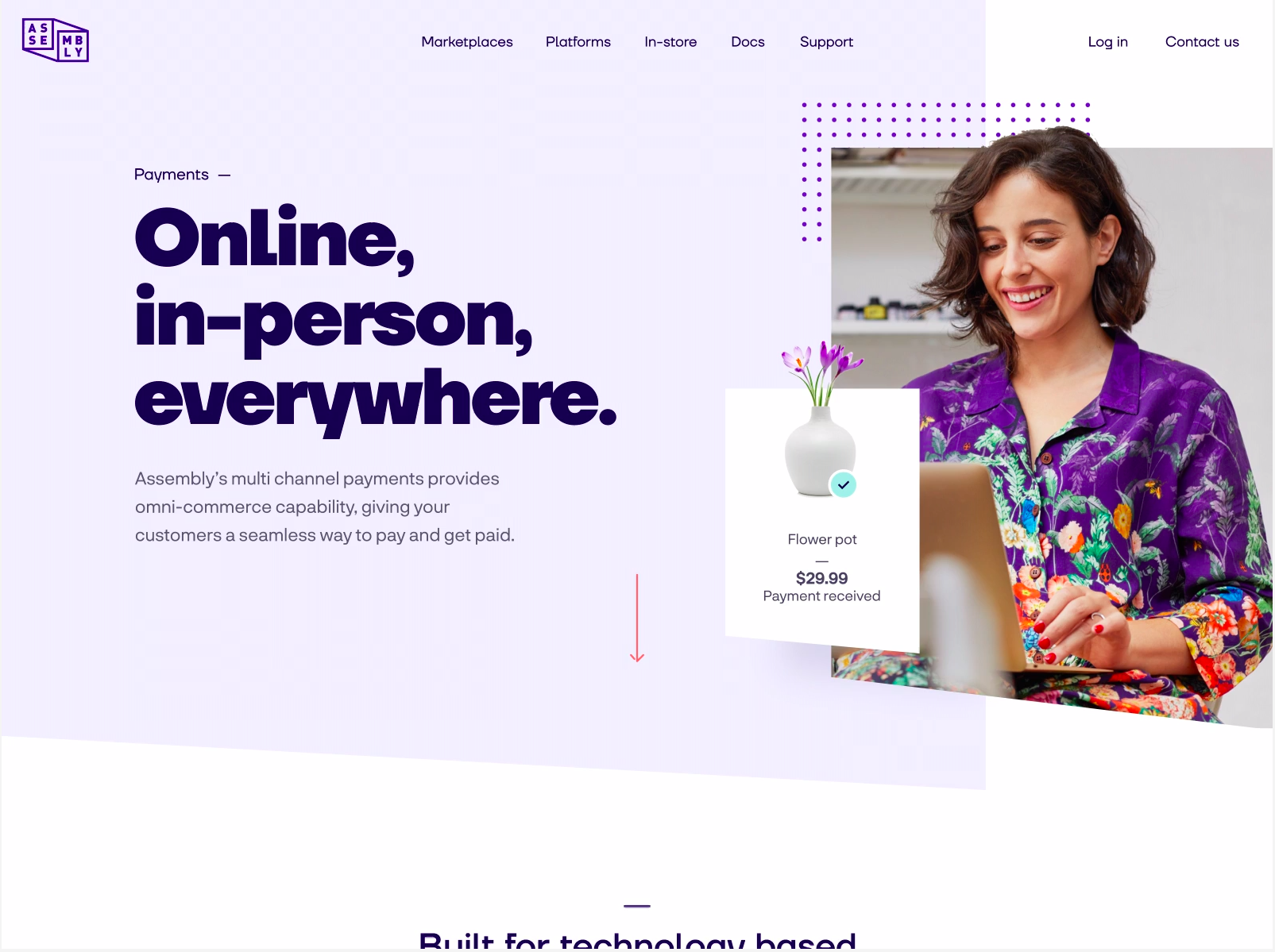
Another example where dots and accent colours spice up plain illustrations.
Tags: illustrations, dots, menuicon
Source: Dribbble
Case Study 11
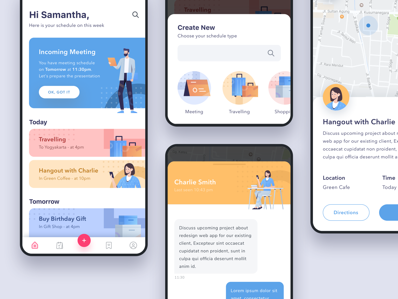
Illustrations made less boring with dots and accent colours.
Tags: illustrations, dots
Source: Dribbble
Case Study 9
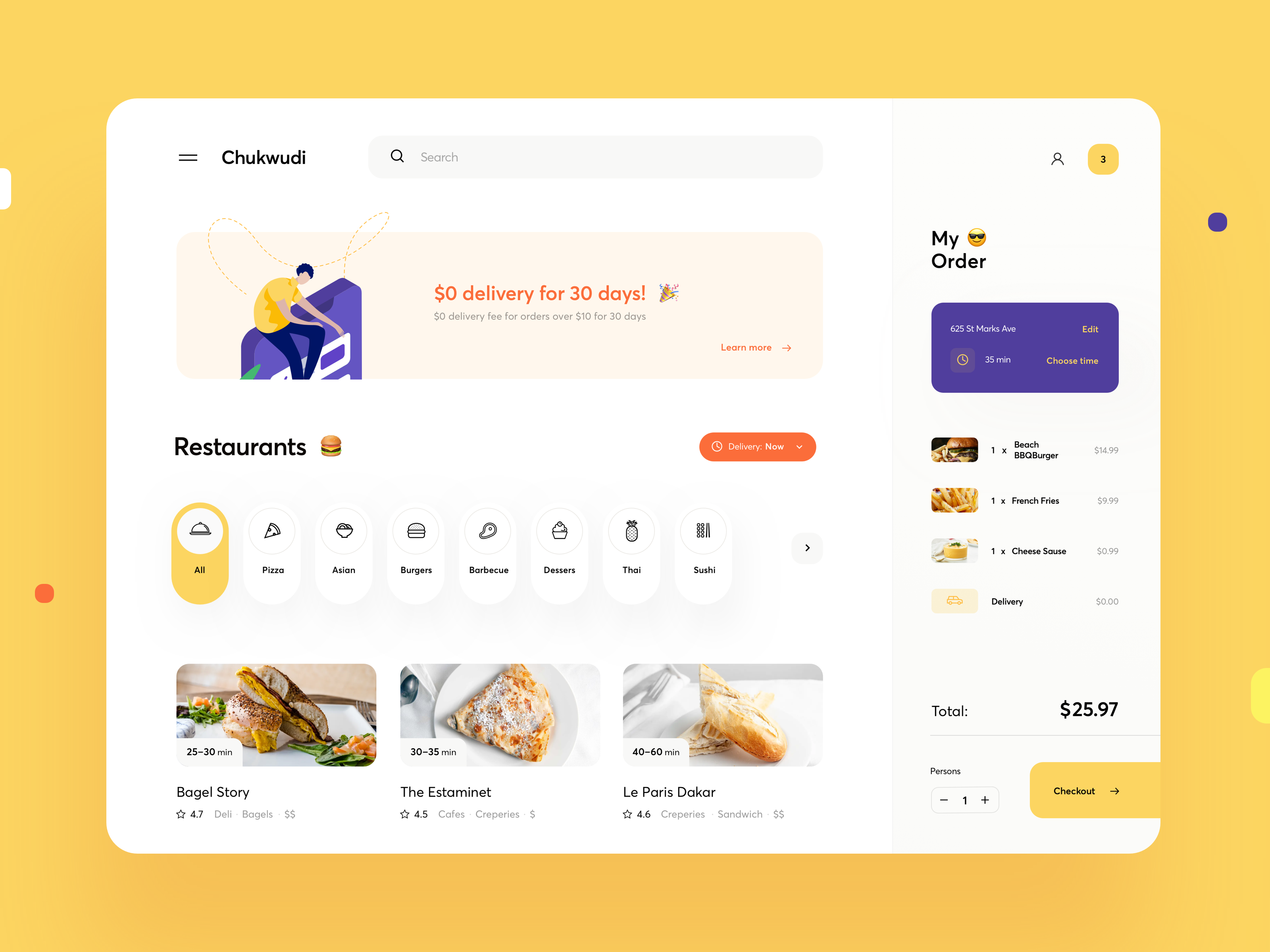
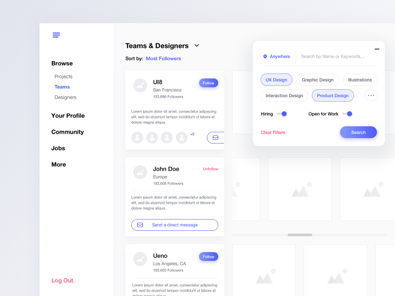
Less commonly seen UI features.
Tags: features, interesting, icons, pills
Source: Dribbble
Case Study 8
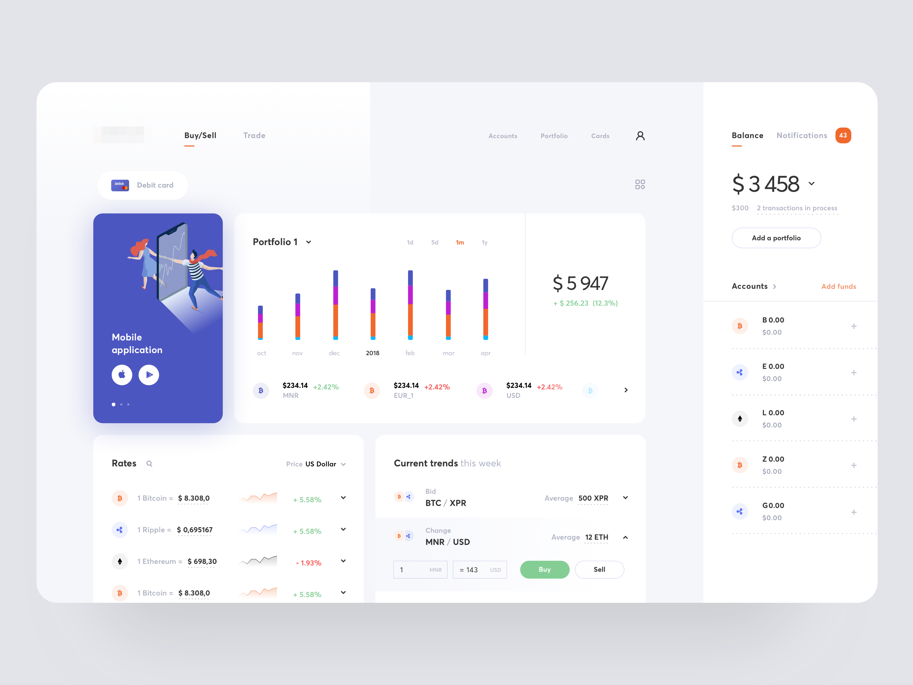
Use of complementary colours to enhance simple icons.
Tags: icons, complementary
Source: Dribbble
Case Study 7
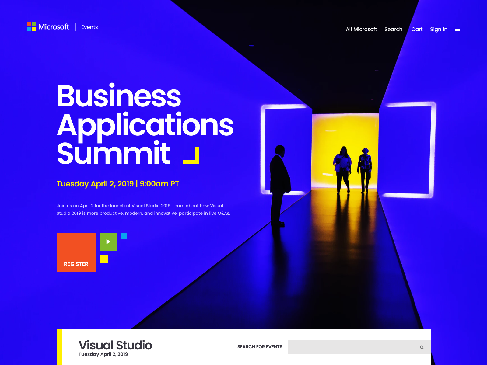
Brilliant use of design against a visually striking background.
Tags: background, colour, striking
Source: Dribbble
Case Study 6

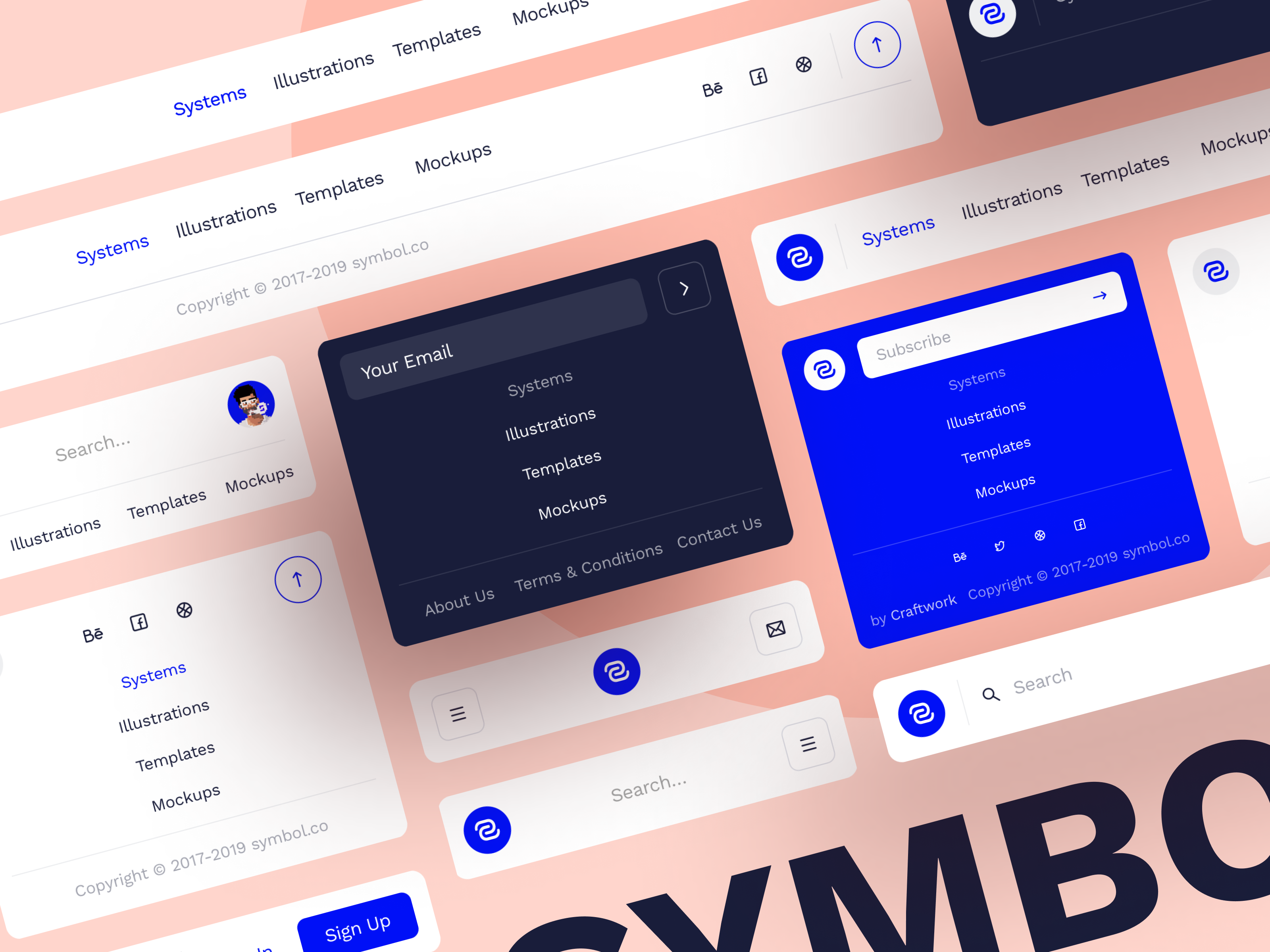
Inspiration for navigation buttons.
Tags: nav, navigation, cta, numbering
Source: Dribbble
Case Study 3
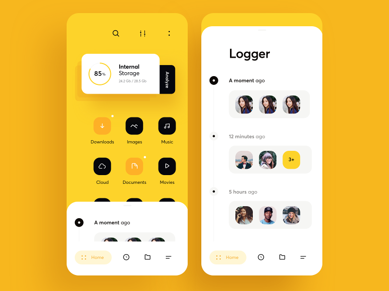
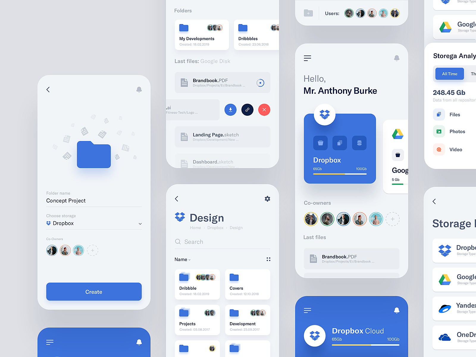
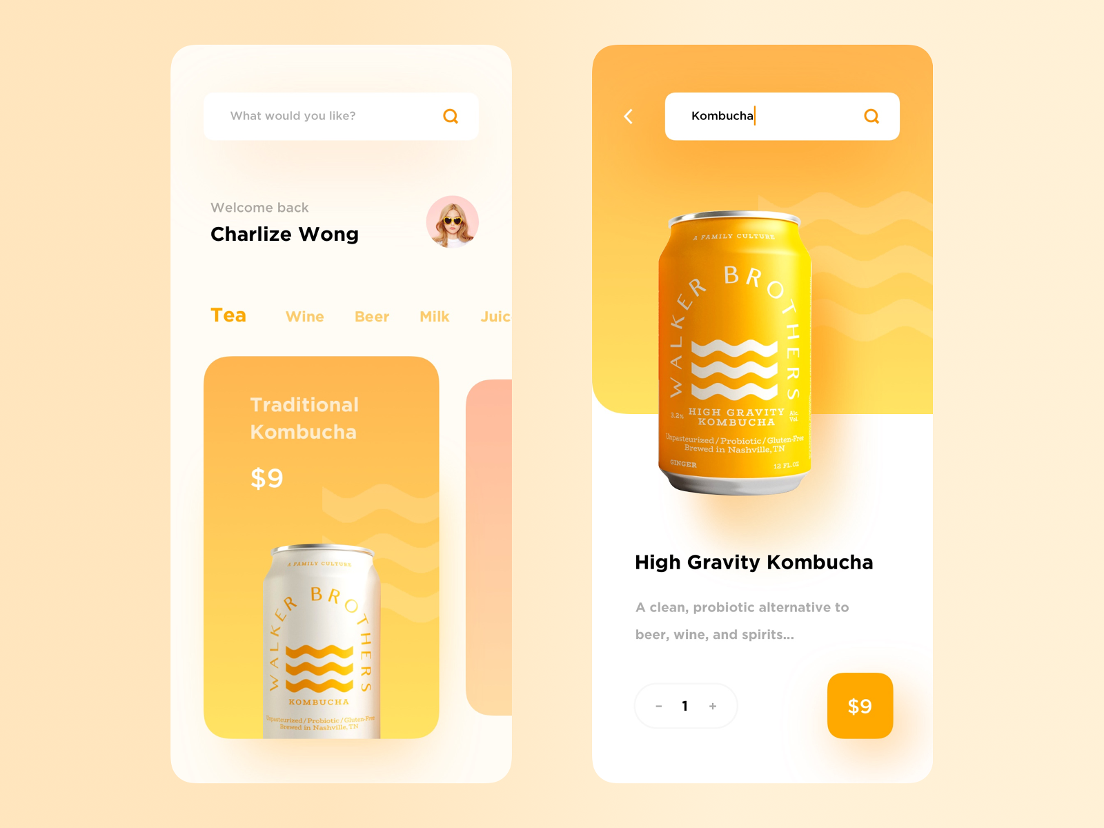
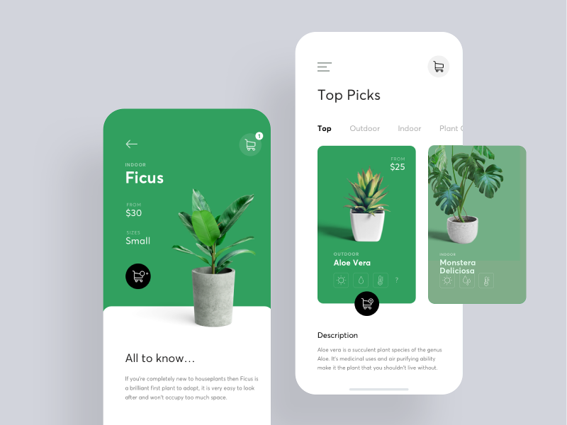
Some UI takeaways from a mobile screen design.
Tags: whitespace, label, shapes
Source: Dribbble
Case Study 2
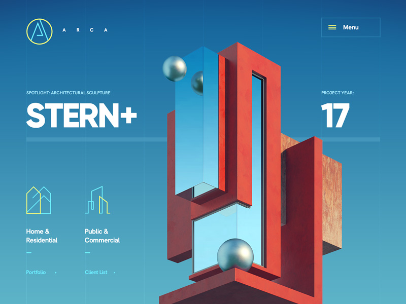
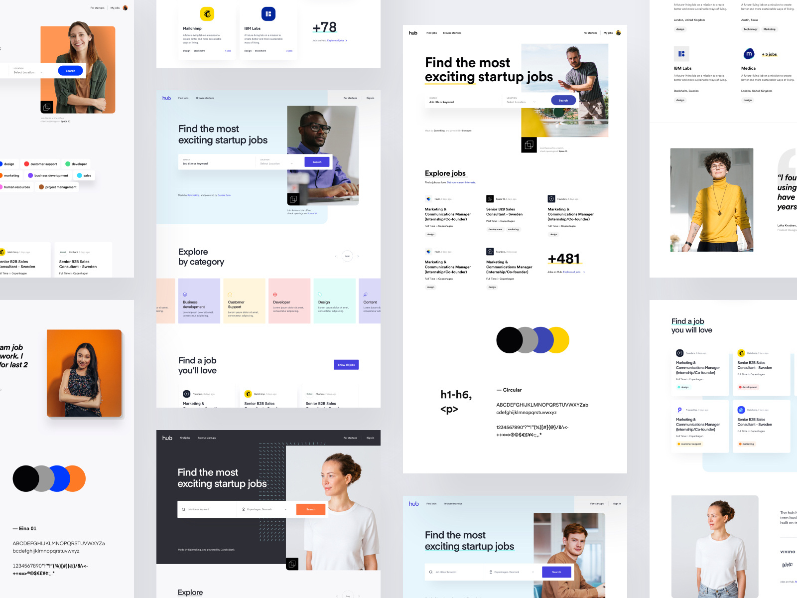
I like this design for the use of accent colours over a non-white background.
Tags: accent colour
Source: Dribbble
Case Study 1

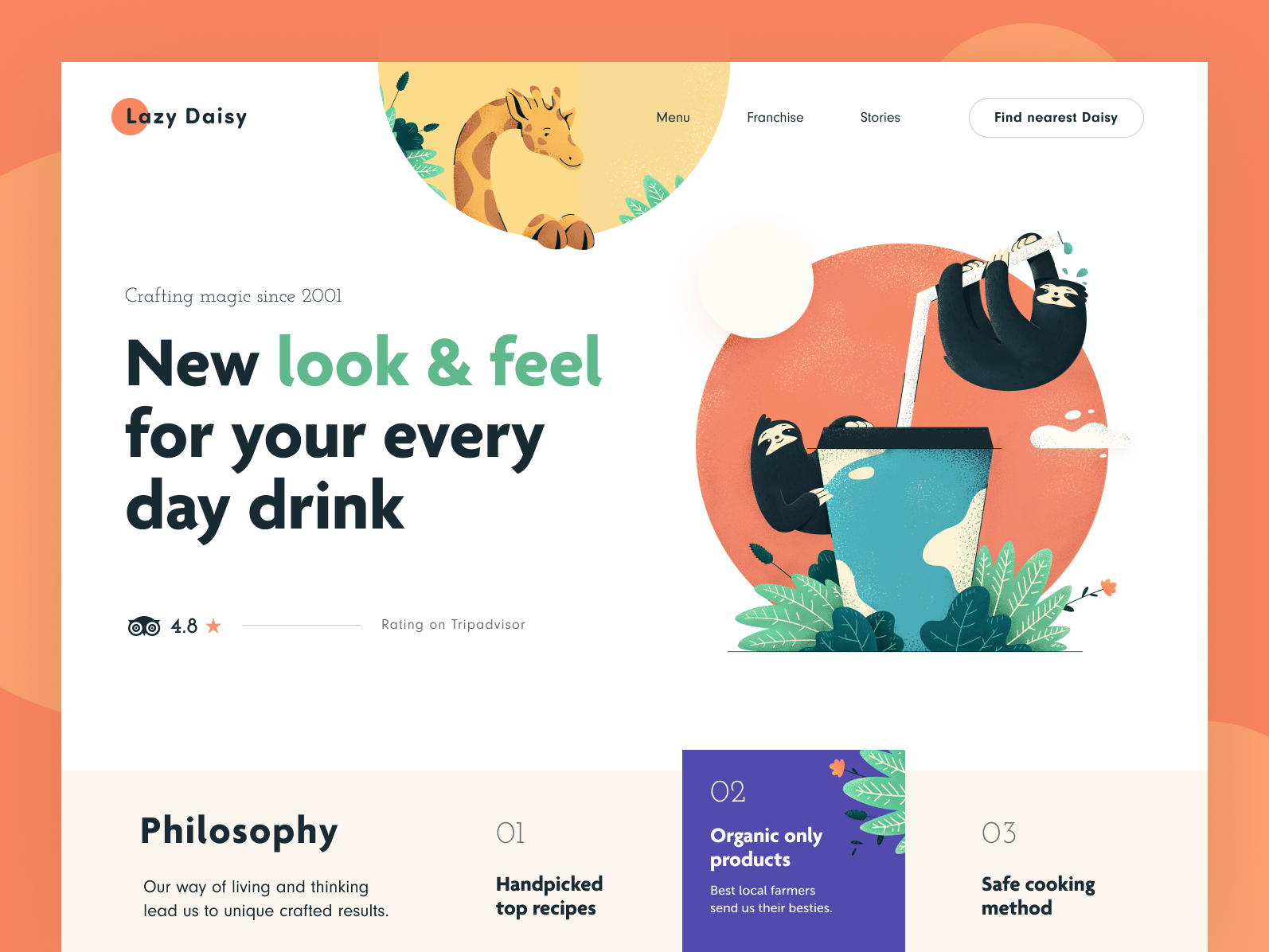
This design shows how simple shapes can construct a pretty landing page.
Tags: landing page
Source: Dribbble
