Case Study 16

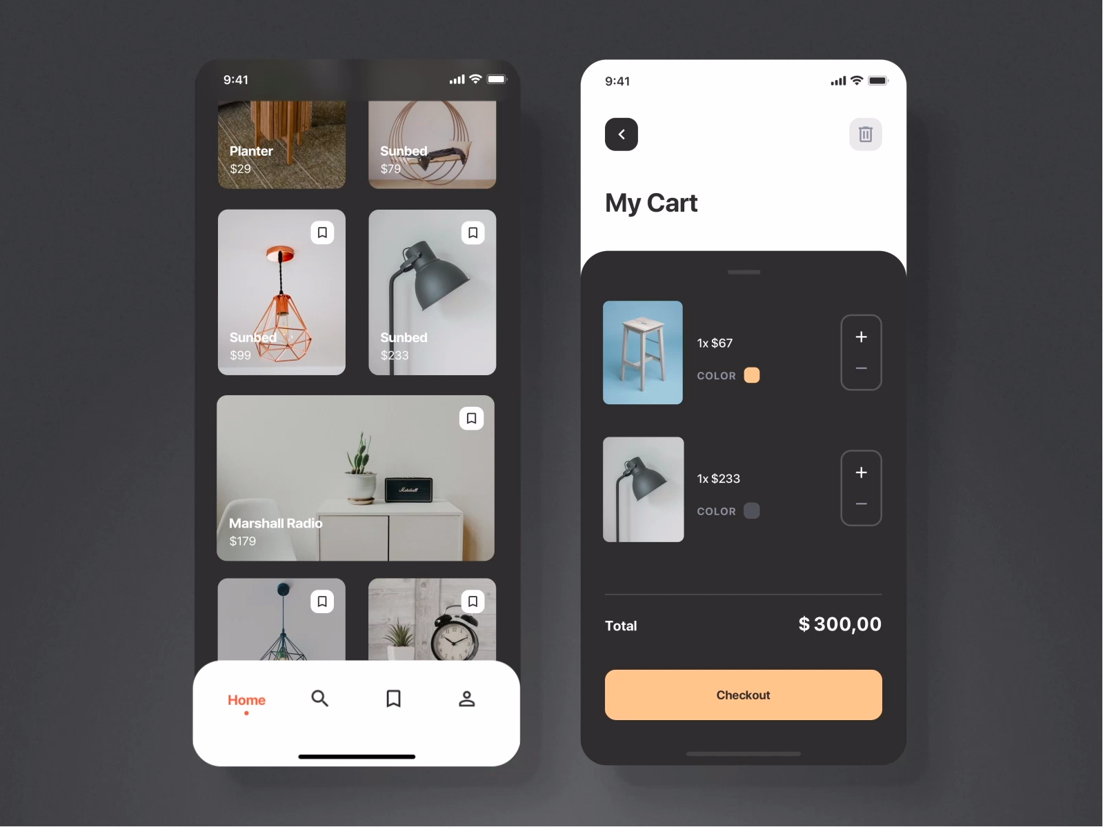
This is originally a video showing the UI for adding items to a cart. It looks polished but that's not what I'm interested in here.
I added this snippet for the colour scheme that I feel works great for any site wanting a polished, up-class (or in Singapore lingo "atas") feel.