Case Study 9

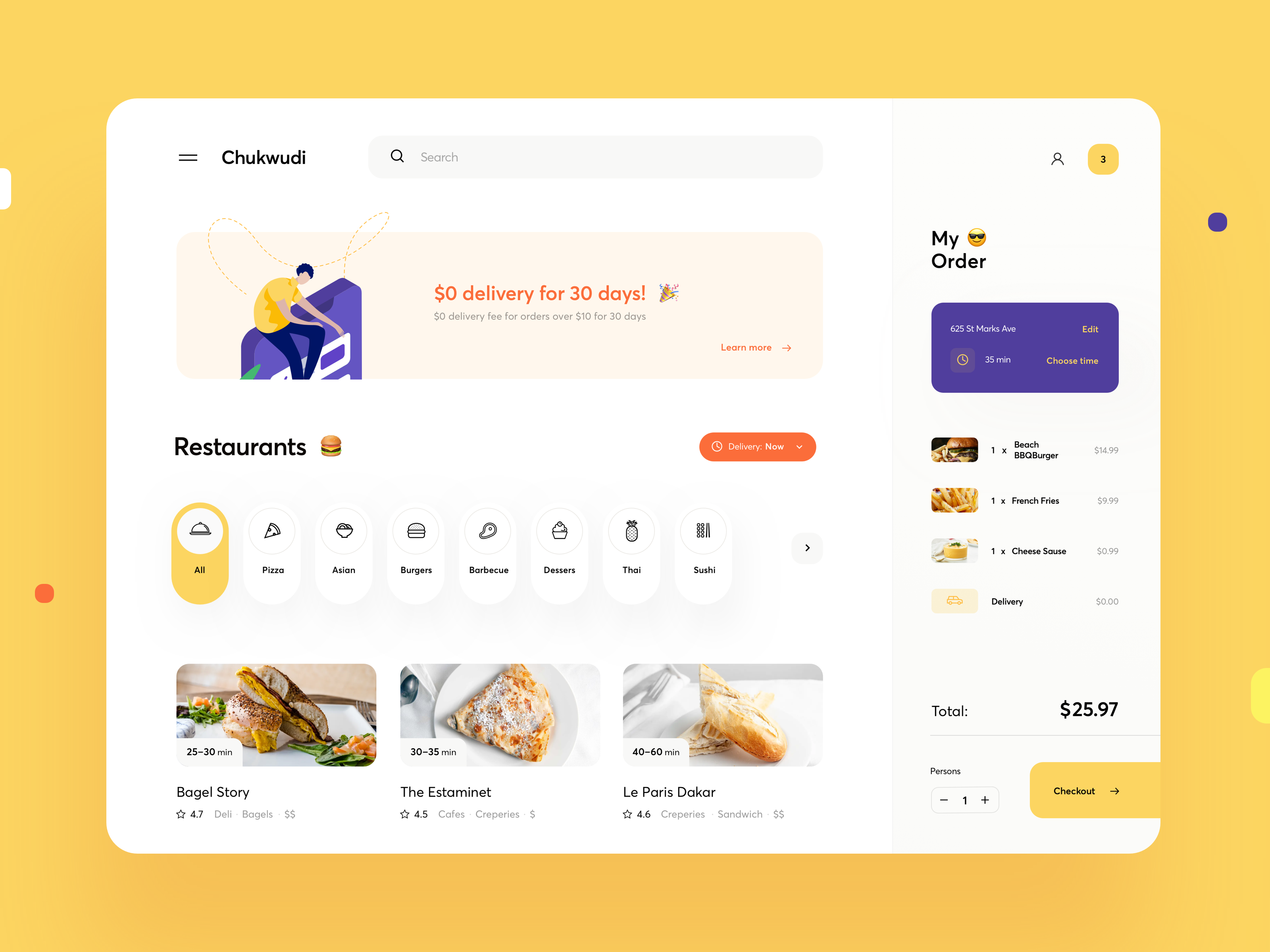
There are several fairly innovative features on this food ordering app that are not commonly seen.
Design Depth
This very little detail would escape most people, but I think it does affect people's perception of the site subconciously. The dotted lines that "escape" the containing rectangle shows more depth to the image/design and adds to the sophistication of the site.
Vertical Pills

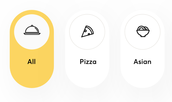
The placement of the food icons inside a white circle that is further encapsulated within a vertical is a design pattern not commonly seen.
This seems like a good technique to place small icons and conserve horizontal space when there are many icons in a row.
CTA
The checkout button is the "final" button on this page. This button is emphasized by extending its visual area all the way to the right edge of the page.
This is more of a design differentiation than a visual hierarchy emphasis. As you can see below, it has the same visual importance even if the button is not flushed with the edge.
